SpeakUp! UX Design for Learners
Project Goal
To design an app for people to learn how to give a talk and then practice giving one.
Skills Applied
Software design for learners, sketching, wireframing, prototyping
Tools Used
Paper and pen, Axure
Duration
One semester - Fall 2014
Group Project for class on Software Design for Learning
The Problem
People have to give presentations all the time: for work, for school, for any number of occasions. But what is the best way to give a talk? How do you practice effectively? And how can you help people deal with the anxiety they frequently have when they have to present? SpeakUp! is an app that addresses these issues, using a 10-minute TED Talk as the presentation genre it targets.
Results
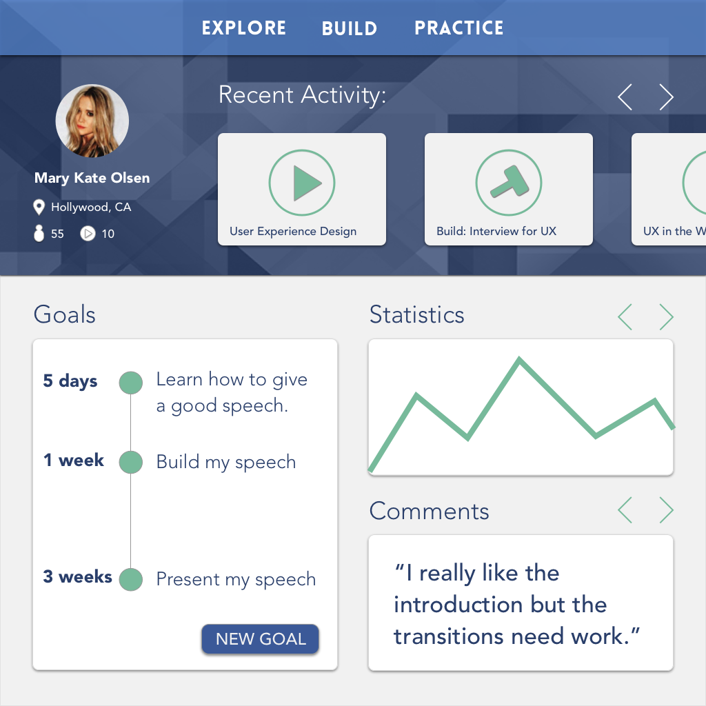
Over the course of the semester, we brainstormed and sketched solutions, made wireframes and iterated on them, made a somewhat interactive prototype, and produced some hi-fidelity comps. The end result is an app that helps user learn what makes for an effective talk, helps them build the structure of a talk, and gives them space to practice (in an environment that simluates where they will give their talk) while getting feedback from other users.
Lessons Learned
Designing for learners involves different considerations. Where regular users might want to get through their tasks as quickly as possible, learners won't be able to learn efficiently if software is not optimized for their needs. Software designed for learners needs to be structured or "scaffolded" in ways that give time and space for users to make connections and gain fluency with whatever they are are learning. Eventually, as learners make progress and gain expertise, this scaffolding can fall away.
The Team
My teammates for this project were Angela Ng and Xin Pan. We all shared equally in the work, though we did have specific areas of responsibility as well. The app had three main sections (Explore, Build and Practice) which we divided between the three of us. I was responsible for the Explore section.
Process and Details
This project came out of my Software Design for Learning class, a course that was cross-listed at the University of Michigan School of Education. The class ended up being one of my favorite classes during my time at the School of Information, maybe because it allowed me to dip my toes back into the world of education.
We had carte blanche to design any app we saw fit, so long as it supported learning in some way. Angela came up with the idea for an app to help people give presentations, after having been to some Toastmaster meetings over their summer. Some of the techniques they use during their meetings (for example, someone is assigned to keep count of how many "um's" occur during a speech) seemed like things that could be automated and made portable through an app.
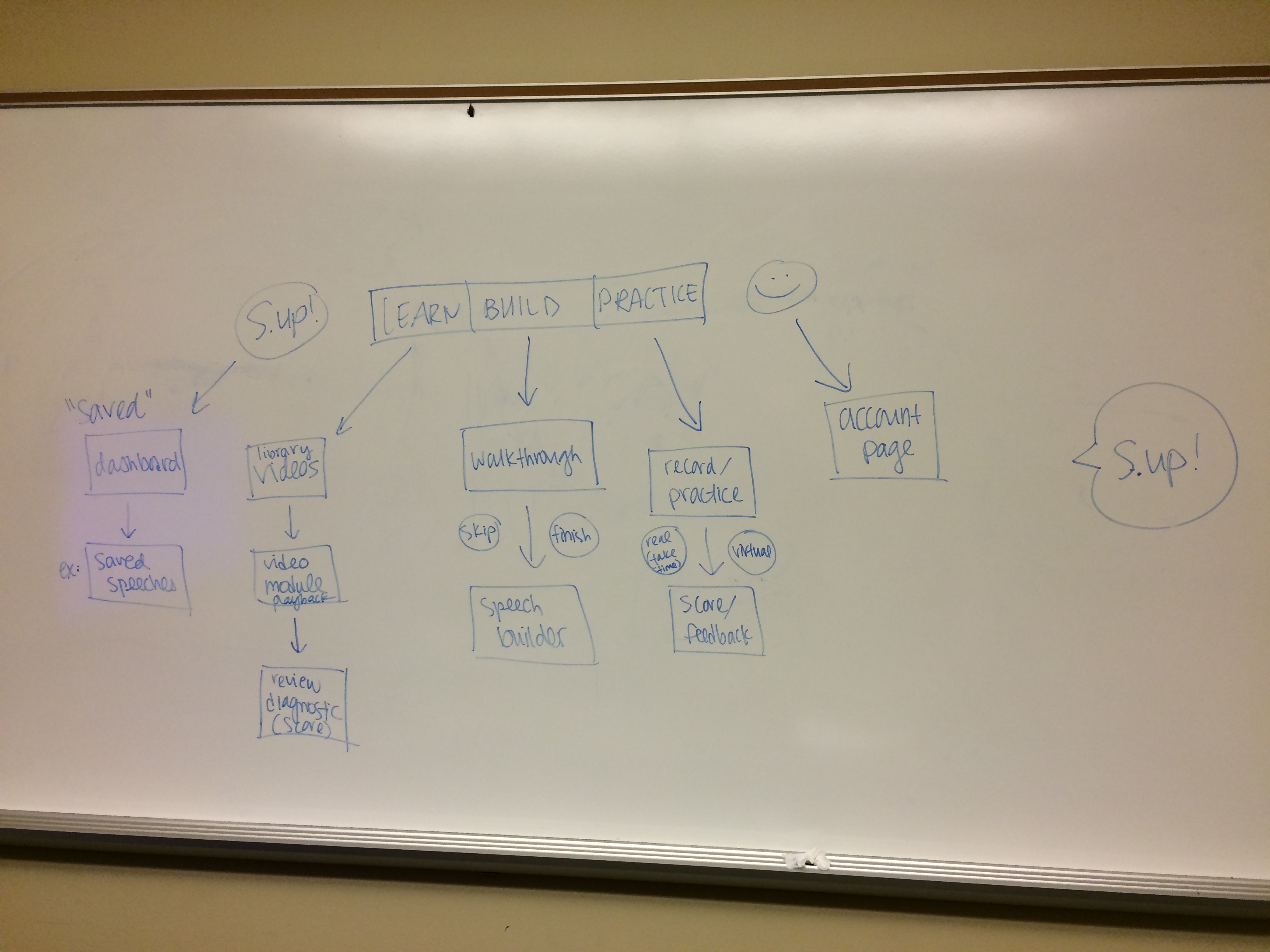
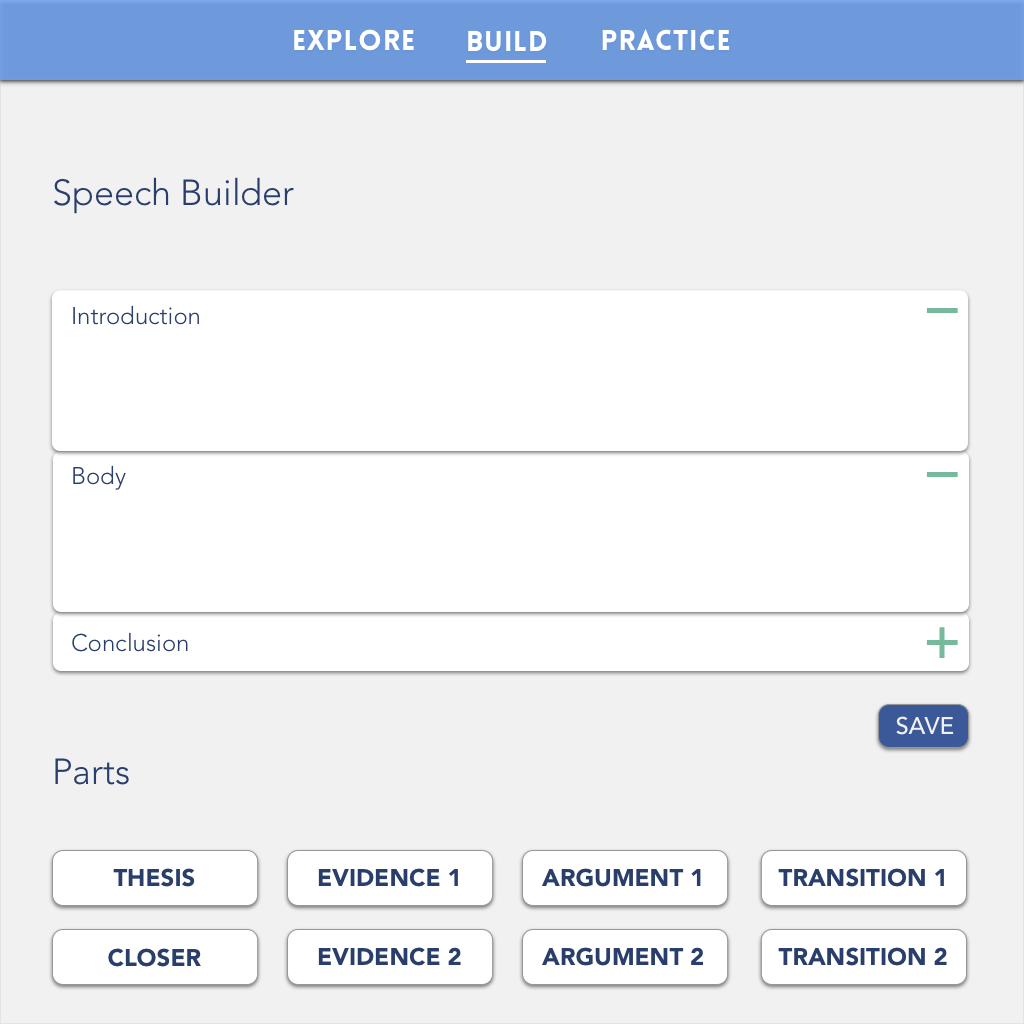
As the semester progressed we added and took away functionality until we got down to three core functions, each represented by a section of the app: learning from other speeches by viewing them and rating them on various criteria (Explore); putting together the structure of the speech in an interactive timeline (Build); and finally practicing the speech in a "virtual" environment designed to simulate where you would be ultimately giving the speech (a classroom, an auditorium, a meeting room, etc.), and being able to receive feedback on your performance from other users (Practice).
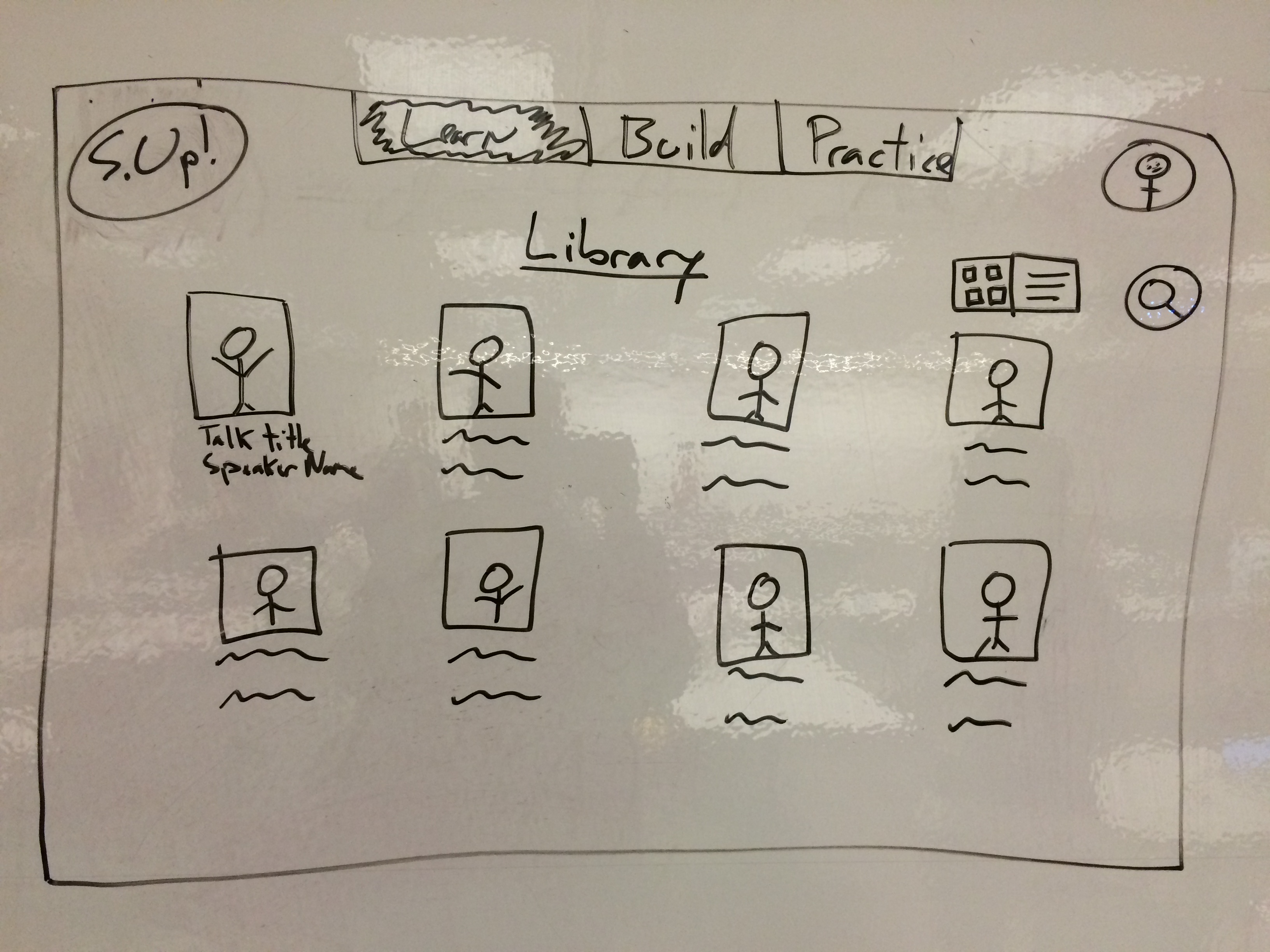
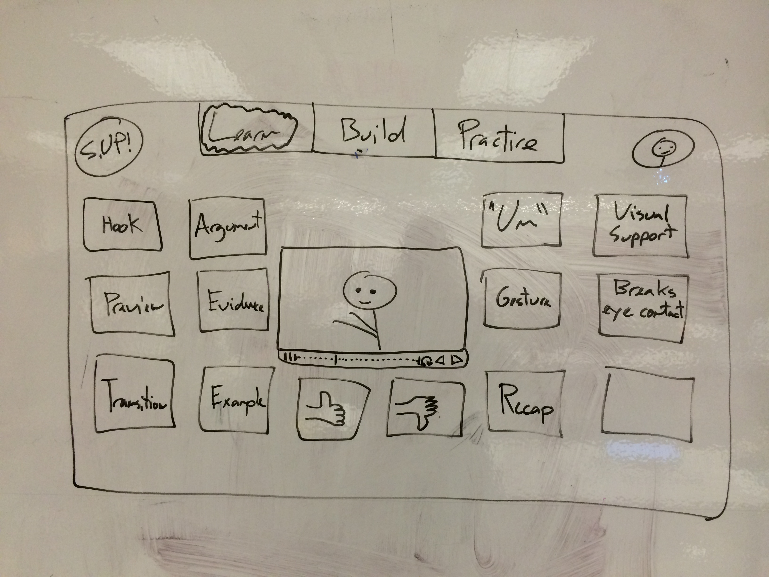
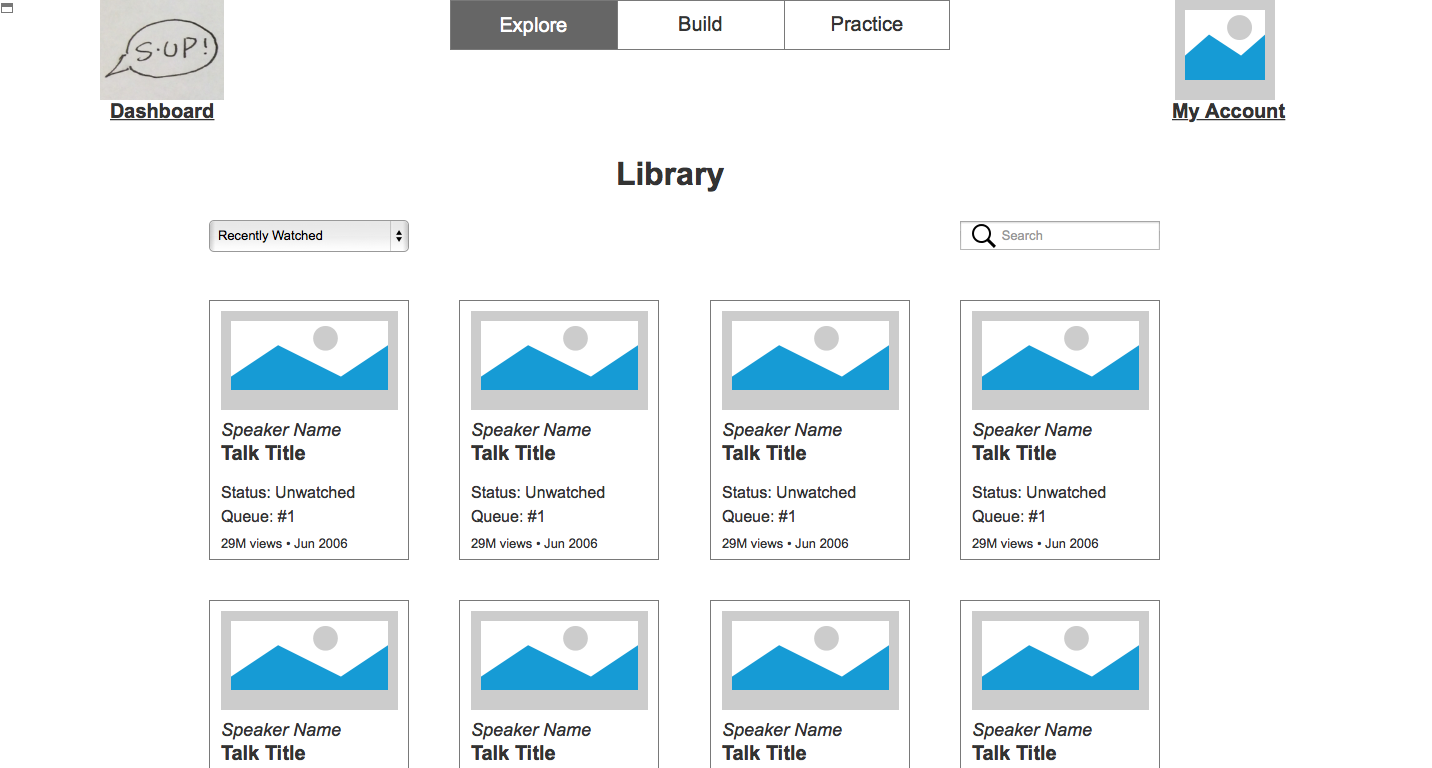
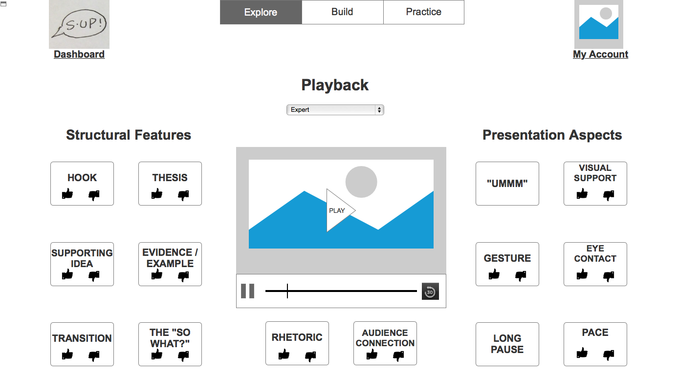
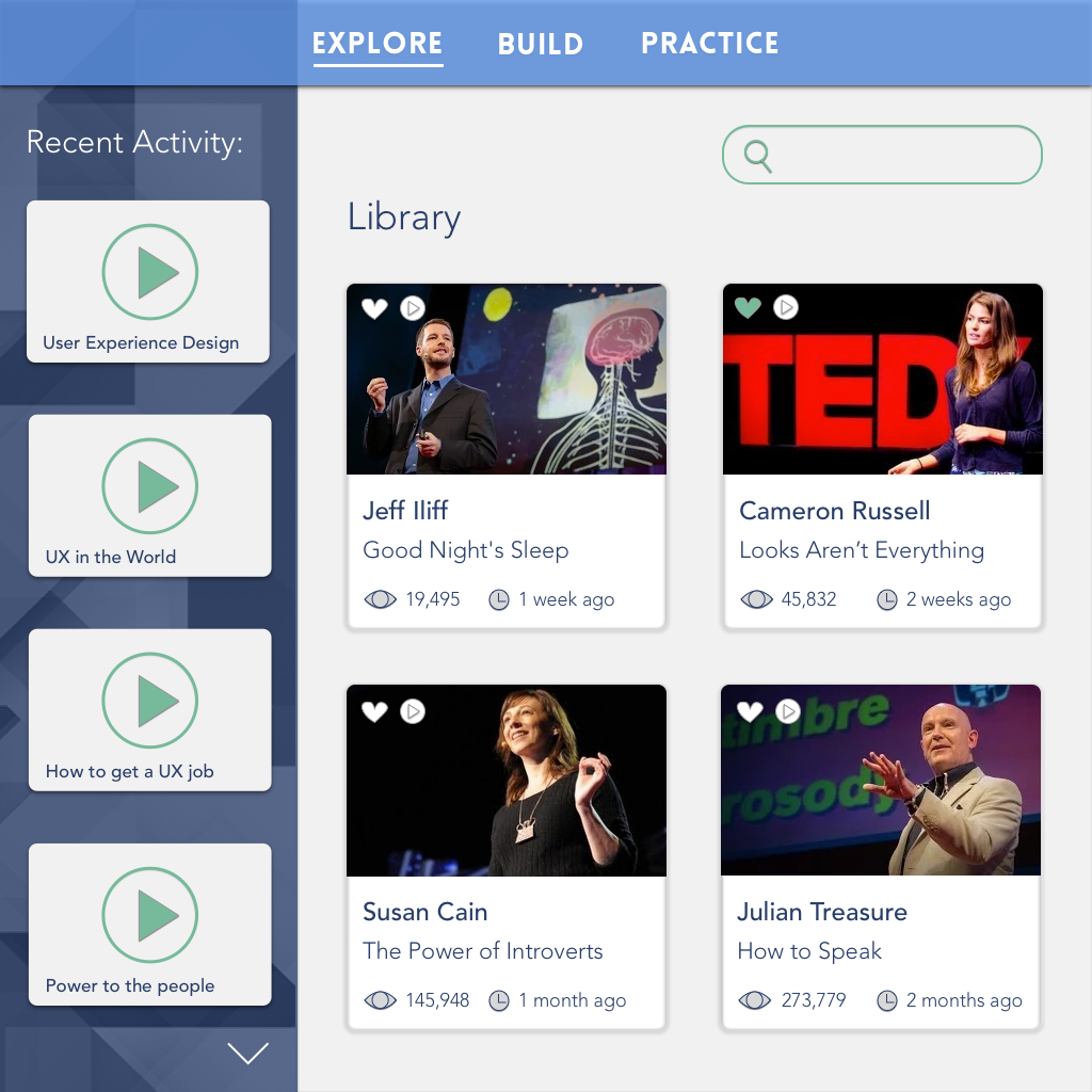
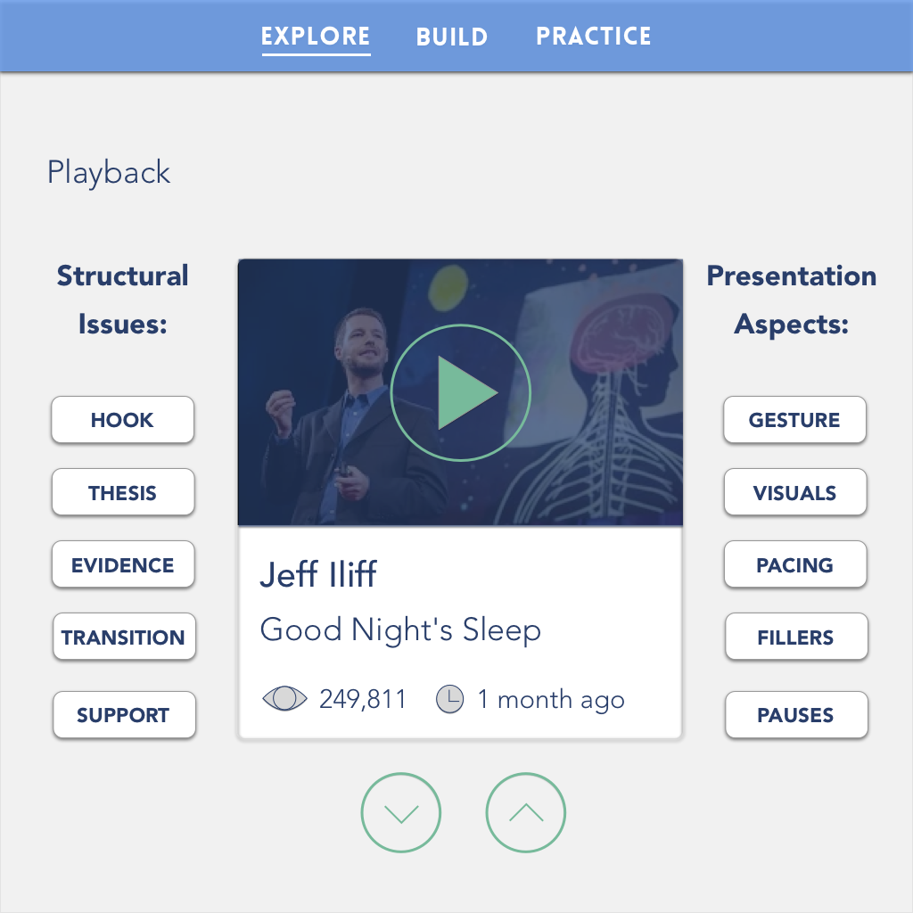
As mentioned before, I was responsible for the Explore section. The goal of this section was to have learners be exposed to a library of excellent TED Talks which they could view within the app (a method of learning that borrows from both cognitivist and constructivist schools of thought). Not only could they view these talks in the app, we designed an interactive rating system that would help them identify and (eventually) evaluate structural features of the talk (e.g. thesis, supporting evidence, hook, etc.), along with aspects of the talk's delivery (gesture, "um's", pacing, etc.).
You'll see below how between the sketching stage and wireframing we added a scaffolded approach to this screen. Users would first start with the simply ability to tap a thumbs up or thumbs down button at moments when they thought the speech was compelling or when they thought it needed improvement. The app would eventually prompt them to enable a more advanced rating level where they identify structural features of the talk; at the next level they would identify aspects of the talk's presentation or delivery; and then finally in the most advanced level they would be tasked with both identifying and evaluating all of these components.
In the last page of the Explore section, the Review page, the user could replay the talk and see a stream of their ratings, along with the ratings that the app had already given the talk. They would receive a score determined by how well the user's rating lined up with the system's ratings (this score would be how the app would determine when the user was ready to proceed to the next level.
This project was one of my favorites during my time at the School of Information and I enjoyed having to think of the needs of learners and design around those needs.
