The Toy-like Nature of Buttons and Gestures
Saturday, January 25th, 2014
In a class last fall we studied the use of color and Gestalt principles in website designs. One thing that stood out to me was just how much buttons are designed to look like toys: little islands of saturated primary colors yearning to be clicked. Below is the travel search website Hipmunk homepage.

Once you start entering the names of airports in the search boxes, the Search button turns from a drab color to this colorful fellow below:

Hipmunk does this throughout the search process and especially in its notable “sort by Agony” page.

Expedia likewise uses a colorful yellow button for its action buttons.
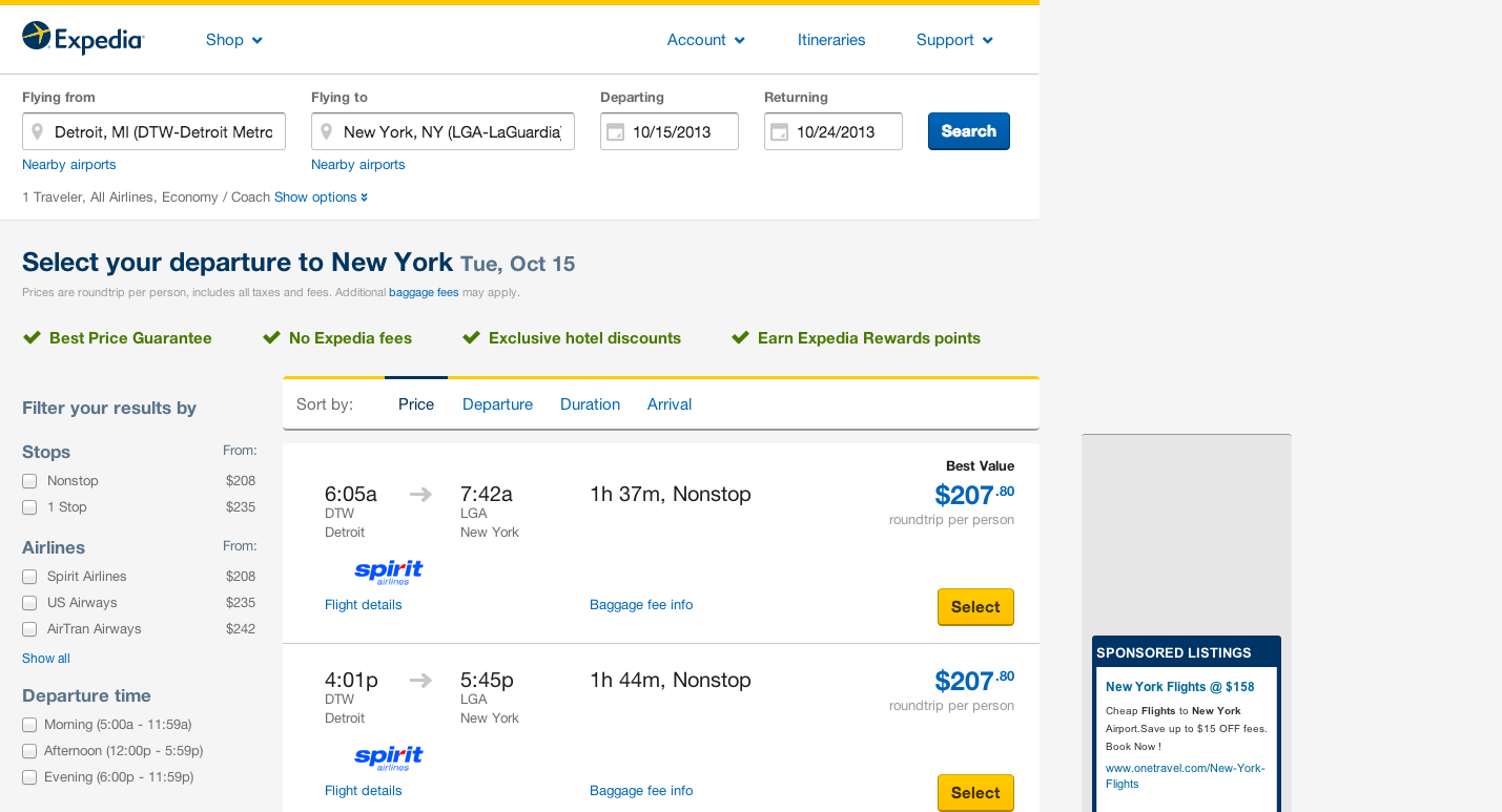

The effect on Expedia’s website is somewhat diminished since yellow is one main colors of the Expedia style, whereas the orange color on Hipmunk is used exclusively for the action buttons.
Color is used to the same effect in the gestures for the Mailbox app on iOS, my current preferred email app, whether on desktop or mobile (well, at least for doing email triage).


Except here you get even more of an endorphin rush from the tactile pleasure of the swipe gesture, whereas the click of a mouse is a rather sterile mode of operation. You can’t really click quickly or slowly, nor can you slowly backtrack as you can with a gesture. It’s such a delight to use the Mailbox app I even (dare I say it) look forward to getting new email to sort with it (though I do have a hard time going without labeling emails in Mailbox… so I created a new list in Mailbox (it’s the brown, long swipe to the left option) called “To Label” so that I could go back and compulsively sort as needed).
The toy-like nature of these buttons and gestures makes for a more delightful interaction, one that we want to keep coming back to, and that emotional connection is something that I hope to keep in mind when I’m designing apps and websites.
